<목차>
1) display: flex;
2) 추가 skill
2-1) 속성 선택자 ~
2-2) !important
2-3) class 여러 개 지정
2-4) input: focus{}
3) tab menu
4) 게시판
5) layer popup
1) display: flex;
이번에는 앞서 자주 사용한 float 속성의 여러 기술적 이슈들을 보완함과 동시에 더 사용이 편리한 display:flex;에 대해 알아보도록 하자.
지금까지는 레이아웃을 구성할 때 주로 position과 float을 이용하여 구성하였다.
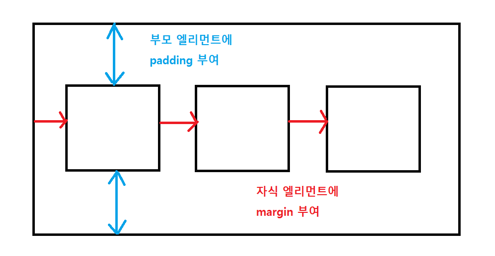
혹은 부모, 자식 관계에 있는 element의 경우, 아래와 같이 부모 element에 padding을, 자식 element에 margin을 부여하여
콘텐츠들을 정렬하였다.
display: flex; 적용 시 하위 태그들(해당 속성을 적용한 부모 태그 기준으로 바로 아래의 자식 태그들까지만 지정한 css style이 적용됨)의 속성이 자동적으로 inline-block 속성을 가지게 됨!!
이번에 알아볼 display:flex;는 이러한 복잡한 방식을 동원하지 않고도 좀 더 편하게 레이아웃을 구성할 수 있게끔 도와주는 속성이다.
즉, 레이아웃을 구성할 때 알아두면 무척 편하고 좋은 속성이다.
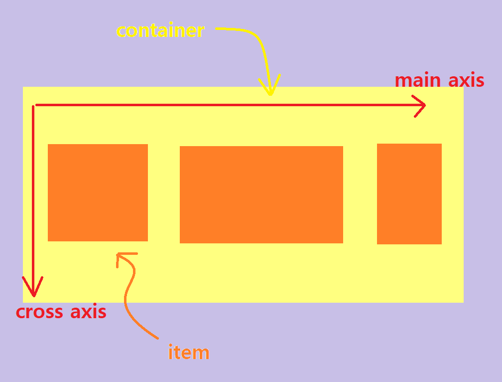
위의 그림과 같이 레이아웃이 구성되어 있다고 했을 때 display:flex;는 container에 그 속성값을 부여한다.
즉, display:flex;는 정렬의 주체가 부모에게 있다.
부모 element에 display:flex; 속성을 부여하고 자식 element를 어떻게 정렬할지 정해주는 방식이다.
display:flex;가 부여됐을 시 적용할 수 있는 여러 속성들을 사용해서 container 안의 item들을 정렬하게 된다.
display:flex;에서의 핵심 포인트는 다음의 두 가지이다.
- display:flex;에는 container를 꾸며줄 수 있는 속성값과 item 각각에 꾸며줄 수 있는 속성값이 있다.
- display:flex;를 적용할 때는 두 가지 축이 있는데, 하나는 중심축(main axis)이고 다른 하나는 반대축(cross axis)이다. 그리고 이 축은 수평 방향이냐 수직 방향이냐에 따라 바뀔 수 있다.
본문에서는 display:flex;에 사용되는 속성들에 대해서는 간략히 언급만하고 넘어가도록 하겠다.
display:flex;에 사용되는 속성들의 자세한 효과에 대해 알아보기 위해서는
구글에 "flex 게구리 게임"을 검색해서 해당 게임을 플레이 해보길 바란다.
또한 flex 속성에 대해 자세한 가이드가 나와있는 사이트도 첨부하도록 하겠다.
< container에 적용하는 속성들 >
- flex-direction: row / column / row-reverse / column-reverse ; 아이템들의 정렬을 row 방향( inline 속성과 동일하다고 이해하면 됨 )으로 하거나 column 방향( block 속성과 동일하다고 이해하면 됨 )으로 할 수 있다. 기본값은 row;
- flex-wrap: wrap ; 아이템들이 한 줄에 꽉 차게 되면 자동으로 다음 라인으로 넘어간다( block 속성과 동일 ). 기본값은 nowrap;
- flex-flow: row nowrap; 위의 두 가지를 한번에 사용하게 해주는 속성( inline 속성과 동일 ).
- justify-content: flex-start / flex-end / center / space-around( 각 element마다 양쪽으로 동일한 간격으로 벌림 >> 마치 각 element마다 동일한 크기로 좌우 padding을 먹인 것과 효과가 동일함 ) / space-evenly( 각 element 간의 간격을 동일한 간격으로 벌림 ) / space-between( 양쪽 끝 정렬 ) ; 중심축 기준 아이템들을 어떻게 배치할지 결정하는 속성.
- align-items: flex-start / flex-end / center / baseline ; 반대축에서 아이템들을 어떻게 배치할지 결정하는 속성.
< item에 적용하는 속성들 >
- flex-grow , flex-shrink : container의 사이즈가 바뀌었을 때 item들이 얼마나 늘어나고 줄어들어야 하는지를 결정하는 속성.
- align-self: flex-start / flex-end / center / baseline : 아이템별로 아이템들을 정렬하고 싶을 때 사용하는 속성.
flex.html
<!DOCTYPE html>
<html lang="en">
  <head>
    <meta charset="UTF-8" />
    <meta http-equiv="X-UA-Compatible" content="IE=edge" />
    <meta name="viewport" content="width=device-width, initial-scale=1.0" />
    <title>Document</title>
    <link rel="stylesheet" href="./public/css/flex.css" />
  </head>
  <body>
    <div id="wrap">
      <div id="header">
        <h1>
          <a href="#">logo</a>
        </h1>
        <div>검색창~</div>
        <ul>
          <li><a href="#">menu1</a></li>
          <li><a href="#">menu2</a></li>
          <li><a href="#">menu3</a></li>
          <li><a href="#">menu4</a></li>
        </ul>
      </div>
    </div>
  </body>
</html>
flex.css
* {
  margin: 0;
  padding: 0;
}

ul,
li {
  list-style: none;
}

a {
  text-decoration: none;
}

#wrap {
  width: 100%;
}

#header {
  display: flex;
  flex-direction: row;
  flex-wrap: nowrap;
  justify-content: space-between;
  align-items: center;
  width: 1200px;
  height: 100px;
  margin: 0 auto;
  background: red;
}

#header > h1 {
  width: 200px;
  background: blue;
}

#header > ul {
  display: flex;
  flex-direction: column;
  background: yellow;
}

#header > ul > li > a {
  display: inline-block;
  width: 180px;
}
2) 추가 skill
2-1) 속성 선택자 ~
- ~ : 동일한 트리구조에 해당되는 태그를 몇 번째에 있든 선택 가능함
- 동일한 트리구조: 부모-자식 관계가 아닌 동등한 레벨의 트리구조에 위치한 태그들을 의미함!!
2-2) !important
해당 속성에 대해 설명하기 위해 다음과 같은 html 코드가 작성되어 있다고 하자.
<!DOCTYPE html>
<html lang="en">
<head>
    <meta charset="UTF-8">
    <meta http-equiv="X-UA-Compatible" content="IE=edge">
    <meta name="viewport" content="width=device-width, initial-scale=1.0">
    <title>Document</title>
    <style>
        #box {
            width:300px;
            height:200px;
            background:red;
        }

        #box {
            background:blue;
        }

    </style>

</head>
<body>
    <div id="box">

    </div>
</body>
</html>
간혹 코드를 작성하다 보면 위에 있는 코드처럼 <div id="box"> element에 두 개 이상의 css 속성이 작성되는 경우가 발생할 수 있다.
이때 동일한 속성에 대해 상대적으로 아래에 위치한 css가 위에 위치한 css를 덮어버리는 현상이 발생하는데
만약 작성된 css의 개수가 많아지게 되면 해당 부분을 찾아내서 수정하기가 번거로워지는 상황에 처하게 된다.
이러한 이슈를 해결할 때 사용되는 것이 바로 !important 이다.
!important는 강제적으로 css를 적용할 때 사용하게 된다.
!important가 작성된 코드에 우선순위를 부여해 해당 코드가 강제적으로 적용되게끔 만든다.
예를 들어 위의 경우처럼 아래에 있는 코드를 무시하고 위에 있는 코드를 적용하고 싶을 때 사용한다.
동일한 id에 css가 여러 개 작성되어 코드가 중복되더라도 !important가 작성된 css가 실행되도록 해주는 것이다.
적용하는 방법은 아래와 같이 css 맨 끝에다가 작성해주면 된다.
<style>
    #box {
        width:300px;
        height:200px;
        background:red !important;
    }

    #box {
        background:blue;
    }

</style>

2-3) class 여러 개 지정
<!DOCTYPE html>
<html lang="en">
<head>
    <meta charset="UTF-8">
    <meta http-equiv="X-UA-Compatible" content="IE=edge">
    <meta name="viewport" content="width=device-width, initial-scale=1.0">
    <title>Document</title>
    <style>

        .box1 {
            width:50px;
            height:50px;
            background:blue;
        }

    </style>

</head>
<body>
    <div class="box1">
        asd
    </div>
    <div class="box2">
        asd
    </div>
    <div class="box3">
        asd
    </div>
    <div class="box4">
        asd
    </div>
    <div class="box5">
        asd
    </div>
</body>
</html>
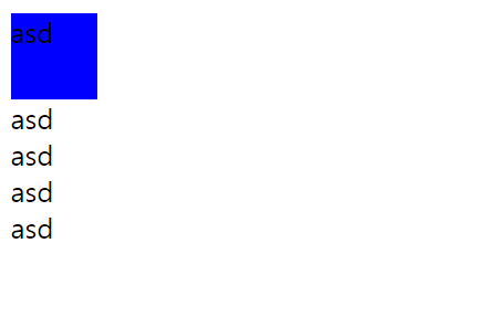
제시되어 있는 코드에서처럼 width: 50px; height: 50px;로
동일한 사이즈의 box를 여러 개 만들어서
각각 색상만 다르게 부여하고 싶은 이슈가 발생할 수 있다.
이러한 상황에서 모든 박스 하나하나에 <div id="box1">, <div id="box2">, ... 이런식으로 id를 부여해 각각 css를 적용할 수도 있다.
하지만 해당 방법은 손이 많이 가는 방법이다.
그렇다면 모든 박스는 동일한 넓이와 높이를 가지고 있고 background만 다른 상황에서
공통된 부분들을 묶어줄 수 있는 방법이 없을까하는 컴퓨터적인 사고를 해볼 수 있을 것이다.
다음과 같은 처리를 통해 해당 이슈를 해결할 수 있다.
<!DOCTYPE html>
<html lang="en">
<head>
    <meta charset="UTF-8">
    <meta http-equiv="X-UA-Compatible" content="IE=edge">
    <meta name="viewport" content="width=device-width, initial-scale=1.0">
    <title>Document</title>
    <style>

        .box {
            width:50px;
            height:50px;
        }

        .red{ background:red; }
        .blue{ background:blue; }
        .gray{ background:gray; }
        .yellow{ background:yellow; }
        .green{ background:green; }

    </style>

</head>
<body>
    <div class="box blue">
        asd
    </div>
    <div class="box red">
        asd
    </div>
    <div class="box yellow">
        asd
    </div>
    <div class="box green">
        asd
    </div>
    <div class="box gray">
        asd
    </div>
</body>
</html>

코드를 살펴보면 <div class="box">에 적용되는 css인 .box { }에는 사이즈(width: 50px; height: 50px;)만을 작성하고
.blue { background:blue; } 와 같이 background를 적용할 css만을 따로 작성하였다.
그 후 <div class="box blue">와 같이 <div> 태그에 여러 개의 class를 부여하게 되면
.box{ }에서 작성된 css와 .blue{ }에서 작성된 css가 둘 다 <div> 태그에 적용되게 된다.
이때 주의할 점은 class="box blue"를 작성할 시 box와 blue를 한 칸 띄어서 구분해줘야 한다는 것이다.
이렇게 class를 여러 개 부여함으로써 코드가 간소해지고 가독성이 높아진 것을 확인할 수 있다.
.w1200 { width:1200px; } , .center { margin:0 auto; } 와 같이 자주 사용하는 것들을 class로 미리 만들어 놓고 해당 css가 필요한 태그에 class를 부여하는 방식으로 많이 활용된다.
2-4) input: focus{}
<!DOCTYPE html>
<html lang="en">
<head>
    <meta charset="UTF-8">
    <meta http-equiv="X-UA-Compatible" content="IE=edge">
    <meta name="viewport" content="width=device-width, initial-scale=1.0">
    <title>Document</title>
</head>
<body>
    <input type="text">
</body>
</html>

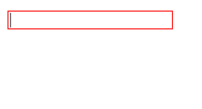
<input> 태그에 의해 생성된 input 박스에 커서가 올라갔을 때
위에 보이는 바와 같이 input 박스 주변에 검정색 선이 추가되는 것을 확인할 수 있을 것이다.
input 박스에 커서를 올려놓았을 때 박스 주변이 변하는 이러한 효과는 브라우저마다 그 처리 방식이 다르다.
input:focus { } 는 <input> 태그에 적용하는 속성으로 input 박스에 커서를 올려놓았을 때
focus되는 선에 효과를 부여할 수 있는 css 속성이다.
여기서 focus란 input 박스에 커서가 올라갔을 때를 말한다.
아래 코드에서 처럼 input:focus { border:1px solid red; } 를 적용하면 focus가 달라진 것을 확인할 수 있다.
<!DOCTYPE html>
<html lang="en">
<head>
    <meta charset="UTF-8">
    <meta http-equiv="X-UA-Compatible" content="IE=edge">
    <meta name="viewport" content="width=device-width, initial-scale=1.0">
    <title>Document</title>
    <style>

        input:focus {
            border:1px solid red;
            outline:none;
        }

    </style>

</head>
<body>
    <input type="text">
</body>
</html>
3. tab menu
index.html
<!DOCTYPE html>
<html lang="en">
  <head>
    <meta charset="UTF-8" />
    <meta http-equiv="X-UA-Compatible" content="IE=edge" />
    <meta name="viewport" content="width=device-width, initial-scale=1.0" />
    <title>Document</title>
    <link rel="stylesheet" href="./public/css/index.css" />
  </head>
  <body>
    <div id="visual">
      <input type="radio" id="tab1" name="tabmenu" checked="checked" />
      <label for="tab1">버튼1</label>
      <input type="radio" id="tab2" name="tabmenu" />
      <label for="tab2">버튼2</label>
      <input type="radio" id="tab3" name="tabmenu" />
      <label for="tab3">버튼3</label>

      <div class="box con1">버튼1에 대한 화면</div>
      <div class="box con2">버튼2에 대한 화면</div>
      <div class="box con3">버튼3에 대한 화면</div>
    </div>
  </body>
</html>
index.css
* {
  margin: 0;
  padding: 0;
}

ul,
li {
  list-style: none;
}

a {
  text-decoration: none;
}

input[type="radio"] {
  display: none;
}

input[type="radio"] + label {
  display: inline-block;
  padding: 20px;
  background: #ccc;
  color: #999;
  font-size: 14px;
  cursor: pointer;
}

input[type="radio"]:checked + label {
  background: #aaa;
  color: #333;
}

/* .box {
  position: absolute;
  width: 500px;
  height: 500px;
  background: #999;
  opacity: 0;
}

#tab1:checked ~ .con1 {
  opacity: 1;
  transition: all 3s;
}

#tab2:checked ~ .con2 {
  opacity: 1;
  transition: all 3s;
}

#tab3:checked ~ .con3 {
  opacity: 1;
  transition: all 3s;
} */

.box {
  position: absolute;
  width: 500px;
  height: 500px;
  background: #999;
  left: -500px;
}

#tab1:checked ~ .con1 {
  left: 0;
  transition: all 0.8s;
}

#tab2:checked ~ .con2 {
  left: 0;
  transition: all 0.8s;
}

#tab3:checked ~ .con3 {
  left: 0;
  transition: all 0.8s;
}

4. 게시판
board.html
<!DOCTYPE html>
<html lang="en">
  <head>
    <meta charset="UTF-8" />
    <meta http-equiv="X-UA-Compatible" content="IE=edge" />
    <meta name="viewport" content="width=device-width, initial-scale=1.0" />
    <title>Document</title>
    <style>
      * {
        margin: 0;
        padding: 0;
      }

      ul,
      li {
        list-style: none;
      }

      table {
        width: 800px;
        border-collapse: collapse;
      }

      table th {
        padding: 14px 21px;
        /* 자주 쓰는 색깔
        #000000
        #efefef
        #eeeeee
        #ececec
        #cccccc
        #dddddd
        #333333
        #666666
        #999999
        */
        background: #ececec;
        color: #666;
        font-size: 12px;
        border-top: 2px solid #333;
        border-bottom: 1px solid #ddd;
      }

      table td {
        text-align: center;
        padding: 14px 21px;
        color: #666;
        border-bottom: 1px solid #ddd;
      }

      table tr:hover {
        background: #eee;
        cursor: pointer;
      }

      .subject {
        width: 45%;
        text-align: left;
      }

      .paging {
        padding: 20px 0;
        width: 800px;
      }

      .paging > ul {
        display: flex;
        justify-content: center;
      }

      .paging > ul > li {
        padding: 8px;
        background: #efefef;
        font-size: 12px;
        border: 1px solid #999;
        margin-left: 10px;
      }

      .paging > ul > li:hover {
        background: #333;
        color: #fff;
        cursor: pointer;
      }

      .active {
        /* !important는 해당 css 속성을 최우선으로 적용한다는 의미 */
        background: #333 !important;
        color: #fff;
      }
    </style>
  </head>
  <body>
    <table>
      <tr>
        <th>번호</th>
        <th>제목</th>
        <th>작성자</th>
        <th>작성일</th>
        <th>조회수</th>
      </tr>
      <tr>
        <td>1</td>
        <td class="subject">hi</td>
        <td>web7722</td>
        <td>2022-10-26</td>
        <td>0</td>
      </tr>
      <tr>
        <td>1</td>
        <td class="subject">hi</td>
        <td>web7722</td>
        <td>2022-10-26</td>
        <td>0</td>
      </tr>
      <tr>
        <td>1</td>
        <td class="subject">hi</td>
        <td>web7722</td>
        <td>2022-10-26</td>
        <td>0</td>
      </tr>
    </table>
    <div class="paging">
      <ul>
        <li>prev</li>
        <li class="active">1</li>
        <li>2</li>
        <li>3</li>
        <li>4</li>
        <li>5</li>
        <li>next</li>
      </ul>
    </div>
  </body>
</html>

5. layer popup
popup.html
<!DOCTYPE html>
<html lang="en">
<head>
<meta charset="UTF-8" />
<meta http-equiv="X-UA-Compatible" content="IE=edge" />
<meta name="viewport" content="width=device-width, initial-scale=1.0" />
<title>Document</title>
<link rel="stylesheet" href="./public/css/popup.css" />
</head>
<body>
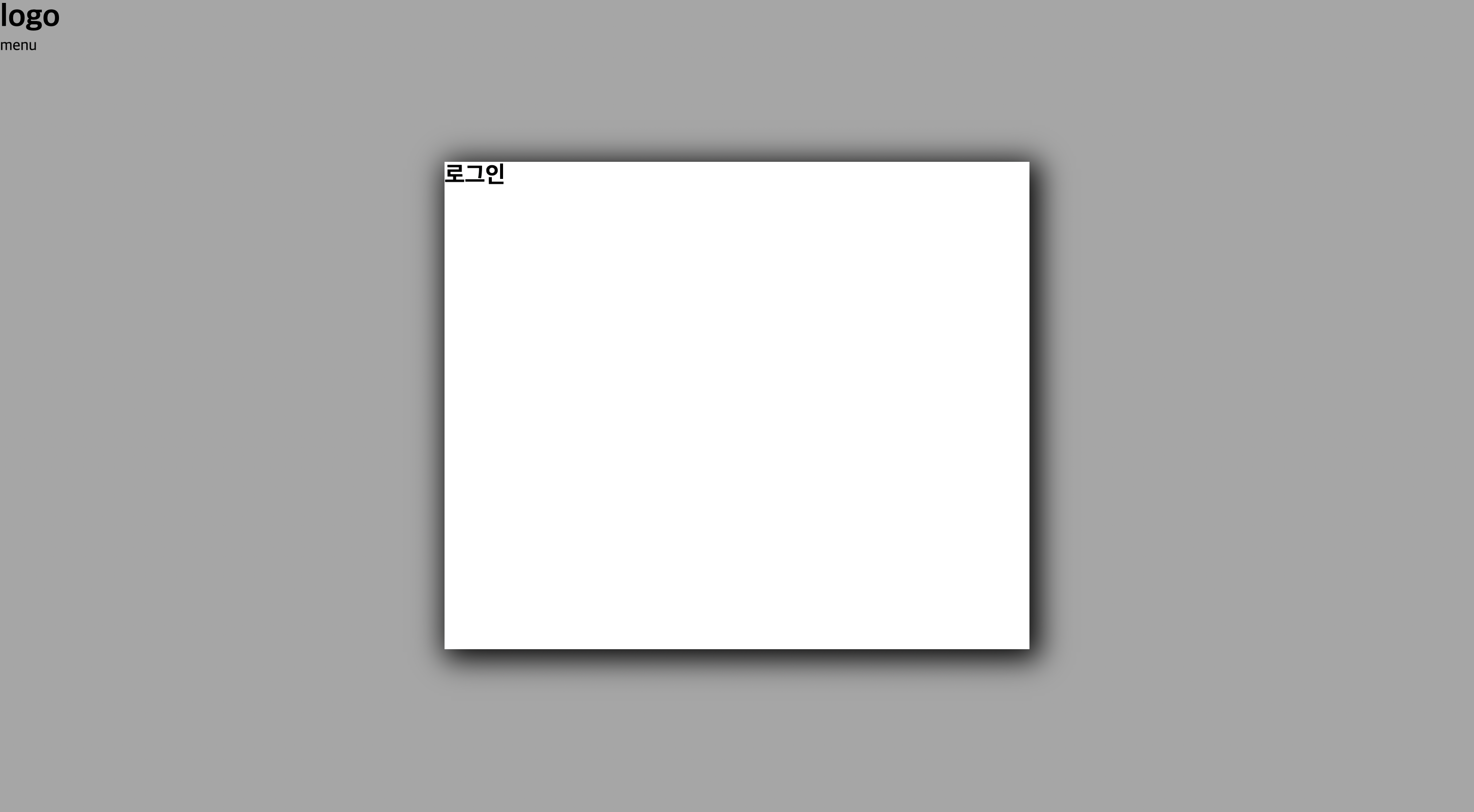
<div id="layer">
<div id="content">
<h2>로그인</h2>
</div>
</div>
<div id="wrap">
<div id="header">
<h1>logo</h1>
<ul>
<li>menu</li>
</ul>
</div>
</div>
</body>
</html>
popup.css
* {
  margin: 0;
  padding: 0;
}

ul,
li {
  list-style: none;
}

a {
  text-decoration: none;
}

#layer {
  position: absolute;
  display: flex;
  justify-content: center;
  align-items: center;
  width: 100%;
  height: 100%;
  background: rgba(0, 0, 0, 0.35);
}

#layer > #content {
  width: 600px;
  height: 500px;
  box-shadow: 5px 5px 30px 5px #000;
  /*
  1. X축 위치 조절: 양수/음수 가눙
  2. Y축 위치 조절: 양수/음수 가능
  3. blur 처리
  4. 그림자의 크기 (default  그림자 주는 영역임)
  5. 그림자 색상
  6. inner shadow(그림자를 안쪽으로 생성해줌)
  */
  background: #fff;
}
'HTML & CSS > HTML & CSS(2022 version)' 카테고리의 다른 글
| HTML & CSS 실습(3) - 로그인 form, menu, media query (0) | 2022.10.27 |
|---|---|
| HTML & CSS 실습 및 추가 skill (0) | 2022.10.25 |
| CSS 복습(2) - 위치 조절 방법 및 기타 사항 (0) | 2022.10.24 |
| CSS 복습 - 적용 방법 및 선택자, 주요 속성 (0) | 2022.10.21 |
| HTML 복습 - 개념 및 기본 문법, 자주 쓰이는 태그/속성 (0) | 2022.10.20 |


